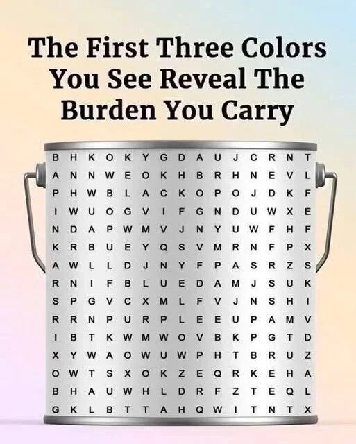
Before we ever speak a word, color begins to tell our story.
The shades we wear, the tones we decorate with, and even the ones we avoid—each choice reflects something about how we feel and what we need. Color isn’t just taste or style. It’s a kind of emotional language, quietly mirroring the moods, memories, and meanings that shape our inner world.
And for those of us who’ve lived through many seasons of life, there’s something especially fascinating about this: the colors around us often shift right alongside us. A deep red scarf, a calm blue wall, a pale yellow mug—small choices that gently record where we are in our emotional journey.
Colors Speak Before Words: Sometimes your hands reach for a shade long before your mind understands why.
When Color Speaks Before Words
Many people think of color as decoration—something we pick because it “looks nice.” But in truth, color is deeply expressive. A favorite hue can act like a private mood diary, reflecting how we feel long before we fully recognize it.
Every shade has a story. The colors we embrace—and the ones we shy away from—often reveal more about our emotional state than we expect.
❤️ Red – The Pulse of Energy and Emotion
Red is pure vitality. It’s the color of warmth, love, and movement. When someone feels drawn to red, they may be craving energy or confidence. It can signal a readiness to take action, a desire to be noticed, or a longing to feel alive again.
But red can also show up when we’re restless or frustrated. During stressful times, some people unconsciously wear more red—as if trying to call their energy back to the surface.
And avoiding red can be meaningful too. Red demands attention. Steering away from it may suggest discomfort with confrontation or visibility, or simply a wish to stay safely unseen for a while.
💙 Blue – Calm Waters and Quiet Strength
Blue is serenity made visible. It carries the stillness of clear skies and calm lakes, encouraging peace and emotional balance. When you feel comforted by blue, you may be longing for stability, reflection, or gentle space to breathe.
That’s one reason blue appears so often in doctors’ offices, spas, and meditation spaces—it helps quiet the body and calm the mind.
Still, there’s another side to blue. Too much blue can sometimes point to emotional distance. It’s the color of connection and solitude at the same time: peaceful, but also protective.
💚 Green – Growth, Healing, and Grounding
Green is nature’s medicine. It blends blue’s calm with yellow’s optimism, creating a steady sense of balance. When we reach for green—plants, fabrics, clothing, even a walk outside—it often means we’re seeking renewal or a fresh start.
That’s why healing spaces often use soft green tones. They promote recovery, comfort, and trust.
Avoiding green can also say something: it may reflect resistance to change or fear of emotional vulnerability. Green invites openness. Declining it can mean we’re not quite ready to grow yet—and that’s okay.
💛 Yellow – Light, Hope, and Curiosity
Yellow is the sunshine of the spectrum. It feels cheerful, creative, and alive. When you’re drawn to yellow, you may be craving lightness after heaviness—a reminder to stay curious, playful, and hopeful.
Yet yellow also exposes. Because it’s such a visible color, avoiding it can hint at discomfort with attention or fear of judgment.
Sometimes, just a small touch—a vase, a scarf, a notebook—can gently reawaken optimism after loss or fatigue.
💜 Purple – Depth, Wisdom, and Change
Purple blends red’s passion with blue’s calm. It often appears during times of transformation, when we’re reflecting deeply or searching for meaning. Throughout history, purple has been linked to wisdom, spirituality, and inner growth.
If you’re drawn to purple, it may signal a readiness to evolve—to move beyond what’s familiar into something more profound.
If you avoid it, it may simply mean you prefer clarity over complexity. Purple can feel mysterious and introspective, and not everyone is in the mood to go wandering through deep waters.
The Color Wheel of Emotions: Each shade carries a different kind of energy—like a quiet language your senses understand.
⚫⚪⚫ Black, White, and Gray – The Silent Shades
Not all emotions are loud. The neutral tones—black, white, and gray—carry their own quiet power.
Black often represents protection and control. People who choose it may be seeking strong emotional boundaries or a sense of inner strength. It isn’t always sadness—sometimes it’s simply armor.
White stands for simplicity and renewal. It’s the color we reach for when we want to clear mental clutter or begin again. In many cultures, white also marks transition or mourning—signaling the shift from one chapter to another.
Gray is the pause between extremes.
It can appear during exhaustion or indecision, offering neutrality and rest. But too much gray for too long may reflect emotional weariness or disconnection.
The Science Behind Color and Mood
Our reactions to color run deeper than preference—they can be physical. Research suggests that different colors can influence the body and mind in subtle ways. Red may increase energy, while blue is often linked to calm. Yellow can stimulate mental activity, and green may support steady focus.
Culture shapes color meaning too. In many Western contexts, white suggests purity and new beginnings. In parts of Asia, it can represent loss and transition. Red might signal love, danger, or celebration depending on where you are.
Yet across cultures, one truth remains: color often reaches emotion first, and logic second. That’s why a single shade can shift your mood before you even notice.
Everyday Color, Everyday Emotion
Think about the mug you reach for in the morning, the sweater you love most, or the shade of paint on your walls. These choices are rarely random. Each one reflects a small piece of your emotional world.Color theory book
After difficult seasons, people often lean toward muted or darker tones—colors that ground and protect. When life begins to brighten, warmer and lighter shades tend to return.
Even the colors we reject have meaning. Avoiding bold reds or yellows may hint at a need for calm. Craving them may signal readiness for renewal.
Home Corner, Mood by Color: Small color choices—pillows, plants, books—can quietly shape how a room feels.
Listening to the Colors Around You
The next time you’re drawn to a color—or avoiding one entirely—pause and ask yourself: What might this be saying about how I feel right now?


